Twitter, like most websites, changes from time to time. One thing Twitter makes changes to is their layout, both in very major ways, and very minor ways. Some changes are major, like turning favorites into likes. Other changes are more subtle, to how they crop images, and so on.
As of the date of publication of this article, the information below should be accurate. I’ll let you know here – by changing this paragraph – if I update the post.
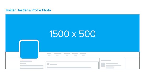
The Header Image
Your header image on Twitter is like a giant billboard that’s only seen some of the time. Anyone browsing their own Twitter feed won’t see it; they have to visit your profile page to see it.
Twitter recommends that you upload a very wide image to be your header. Their intended dimensions are 1500 x 500; 1,500 pixels wide by 500 pixels tall. Simple, easy, end of story, right?
Well, it is if you’re like The Onion and just use an image from a recent popular article as the top banner. There’s no need to be complex with a layout; just crop an image to the right size and upload it. As long as it looks good, it’s fine to use.
If you’re like some businesses, though, you might want something a little more optimized. It’s generally a good idea to use your top banner as a call to action. There are a lot of problems, though.
First of all, the size of the top banner is not 1,500 by 500. It’s actually more like 1,263 by 421, if you’re using a typical widescreen monitor. That accounts for a vertical and horizontal gutter, which can be used in some resolutions. If you were to inspect the background element and view the image of a given banner, you will typically see at least some more vertically on the top and bottom of the image.
You can see how Twitter dynamically adjusts the image if you click and drag a browser to resize it. You can see how, at different resolutions, the image will slightly zoom in or out; this is adjusting using the space available to it. Once you shrink small enough, you’ll get a scroll bar instead.
Then you have to consider mobile. When using the Twitter app, the same image appears in the same dimensions, shrunk down. What this means is if you want to use some kind of call to action in text on your banner, you can’t make the text so small it shrinks to unreadability.
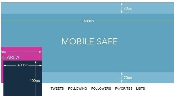
If you’re putting a call to action on your top banner, you need to do two things. First, avoid the absolute top and bottom of the image. Some of that space is taken up by the gutters to give the image room to zoom and adjust.
Secondly, avoid the bottom-left corner about a third of the way in from the left. There’s a section there that is covered up by your profile image and the thin border around it. Any text or call to action you place in that section will be hidden behind your profile picture.
Protip: use a much larger image! Twitter recommends a minimum of 1500×500. You’re not limited to that! I often find myself uploaded 1920×1080 images and playing around with zoom, horizontal and vertical positioning, and cropping to position it exactly where I want.
One thing you can do is make your banner and then expand the canvas in all directions by a few hundred pixels. When you go to upload the image, you can then carefully position it exactly the way you want it to appear.
Profile Photos
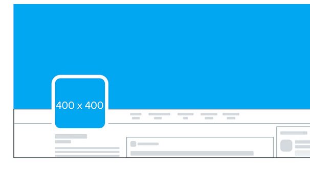
Your profile photo these days is a circle. Here, Twitter recommends a square image that is 400×400 pixels. Your display will be a circle roughly 400 pixels across, but again, you get to adjust the image when you upload it. A 400×400 pixel image or a 2000×2000 pixel image both get the same zooming options.
When you upload an image to be your profile image, you can zoom it in and out, and you can slide it around horizontally and vertically if you have it zoomed in enough that it doesn’t cut off the edge. You are limited to the edges of your image, which is why Twitter recommends one of a sufficient size.
Zooming is not unlimited. You’re able to zoom an image outwards only if it is NOT a square image. You can zoom out slightly until either vertical or horizontal is the minimum available space. In the few images I’ve found that can do so, it’s about an 80% zoom. Meanwhile, you can zoom in about 150% or so, perhaps up to 200% in a perfectly square image, to get the exact positioning you want.
The reason Twitter wants a 400 pixel square image is so that they have minimal resizing to do. An exceptionally large image would need to be downscaled when uploaded, which results in a blurry image. An exceptionally small image will be too pixilated and will be rejected.
In this case, my protip from above is not really applicable. Instead, I have a different one.
Protip: Make your image slightly larger than necessary. Make your logo image, edge to edge, 400 pixels, then add a gutter of about 50 pixels on every side, keeping it square. That way, when you upload the image, you can zoom it in enough to give it just enough space around the edges to look good with the border but without actually reaching out to touch it. The small bit of fine tuning can be worthwhile.
Image Post Dimensions
When you post images to your feed, it collapses to fit their post format. Sometimes this means it cuts off the top and bottom of the image. If you post several images, you end up seeing one take up two thirds of the space, and two or three more dividing up the rest of the space. Twitter posts individually can only have up to four images in them.
When a photo is part of a post and is attached to a link, that photo is 440×220 pixels. It’s broadly horizontal and does not expand when clicked; the click takes you to the post instead. You can, as before, have this scaled up, but it will be cropped down and you don’t have the option to adjust it.
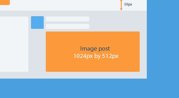
When you simply upload four images, they are displayed in the order you upload them. The first image is the main image, and the remaining one, two, or three are given sections of the remaining space. If you only upload two images, they split the same 440×220 space into two 220×220 squares.
One single image will be given a maximum of 440×440 space. If the image itself is smaller horizontally, it will be slightly cropped at the top and bottom. If the image is smaller vertically, it will be displayed in letterbox format unless it’s much too wide, in which case it will be cropped.
Uploading three images will put one image as a square taking up the left-hand two thirds of the image, with the remaining two as squares vertically stacked to the right of it. Uploading four images is the same, except more area is given to the primary image to allow for a taller vertical stack of squares for the three other images.
This is all tricky, but in practice it just means “upload square images whenever possible.” Twitter will try to display as much of the image as it can within the square. If any of the image is cropped – for longer vertical images, mostly – the user will have to tap it or click it to see the full thing.
Tips for Using Images on Twitter
First up, your profile photo. 99% of the time, your profile photo should be a photo of you or your logo. I know a lot of artists choose to use a piece of their art, or an artistic self-portrait, as their profile picture; this is perfectly fine as well.
In general, you should avoid other forms of profile photo. Leaving your profile photo blank will result in a basic empty profile silhouette, which is likely to leave you with less trust than with a filled out account.
I don’t recommend using your profile photo as a call to action. In almost every mode of display, it is simply too small. Nothing you put in that space will really be visible.
As for your top banner image, it’s a great place to showcase what you do. A bank might have a scene of a teller and a happy customer. A photographer might show a photo they took of a brilliant landscape. An artist can showcase a larger piece they’ve produced recently.
Local businesses often find it worthwhile to take a photo of their location, which can help users find them if they’re tucked away or in a nondescript building.
Other brands, particularly digital brands, can make use of the profile banner as a sort of advertising billboard. Put a larger text-based call to action, with illustrations, similar to an infographic or a landing page, in that space. You can showcase a book cover or a series of book covers of ebooks you have produced, for example.
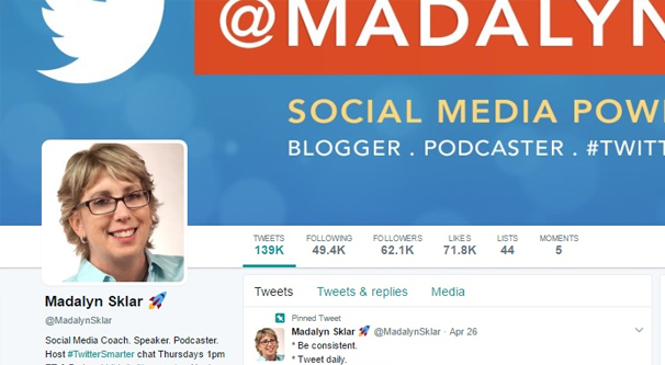
Other businesses might do something that matches current trends. Hubspot as of this writing has a large pride banner in their signature orange, while their profile photo is the pride flag rainbow.
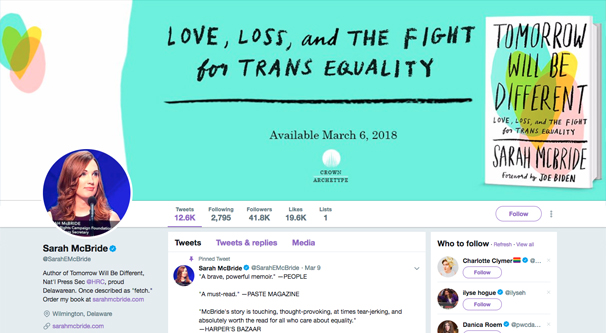
Sarah McBride, an author and press secretary for the human rights campaign, uses her profile banner to promote her book. It’s a large, simple image with a call to action and an image of the book cover, and it performs excellently.
When you post an image as part of a tweet, remember that a single image works best in a letterbox format. You can create an image and use it to expand your text space. Use a soft CTA and description in your 280 characters, and use the image as space for a bit more text. Remember, Twitter isn’t Facebook, and you won’t get a post rejected for having too much text on it.
Remember that if you want to upload multiple images at a time, you’re limited to four at max. One or two at a time gives them equal visibility, but three or four means the second through fourth images will be scrunched down and given less space. You might end up with something like this recent post about a new Nintendo game where the third and fourth images are themselves collages that shrink to almost incomprehensibility.
Otherwise, most uses of images on Twitter will come down to using Twitter Cards. Thankfully, I have two good resources for you. The first is this post on installing Twitter cards on your site. There are a bunch of different styles of Twitter card, though, and learning all about them can be tricky. That’s why we have the ultimate guide to Twitter cards.
Beyond all of that, I can’t really give you any Twitter image tips other than the usual. Make high quality images, avoid covering them with so much text they lose any imagery at all, and make sure they stand out from the morass that is the usual Twitter profile. You might consider using gifs or videos whenever possible, to add motion and make your post stand out.
I’ll be sure to update this post if I notice Twitter changing their behavior or their sizes again. Check back if you think something is up, and leave a comment if I haven’t noticed yet!