Twitter website cards are a specific kind of promoted tweet, one that comes with a handful of benefits to the businesses that use them. They aren’t broadly available to everyone; in fact, you can only access them through the paid advertising system on Twitter. So what are they, exactly, and how can you take advantage of them?
What are Twitter Website Cards?
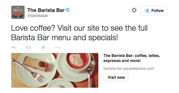
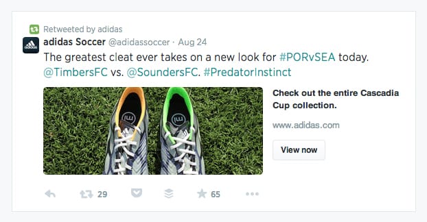
A Twitter website card is obvious when you see it. It looks generally like a normal tweet with an image, at first glance. When you look deeper, though, you see additional meta information. Specifically, you’ll see the title and URL of the website the image links to, and some sort of call to action button. CTA options include things like “order now” and “view now” for different types of content.
Twitter cards also work with videos and apps, and there are specific on-website Twitter cards for promoting a tweet rather than the other way around. I’ll mention these other types of cards later. For now, we’re talking specifically about the website card.
The purpose of the card is to capture a lot of clicks that you wouldn’t otherwise capture. See, when you post a normal tweet with an image, if a user clicks that image, they’re just taken to a lightboxed version of that image. It’s the same thing, just larger, typically full size. This is fine, if what you’re showcasing is the image.
On the other hand, when we advertise a website link with an image, and a user clicks that image, they aren’t going to your site. They have to close out of the larger image view and click the link in the tweet if they want to go to your site. Often, they’ll lose interest by that time and they won’t put forth that effort.
- A website card turns that image into your link. In addition to the meta data, which is frankly a little extraneous compared to this, clicking anywhere on the image just brings the user to your destination. This captures a lot more traffic, both from users who wanted to visit but lost interest and from users who just wanted to see the larger image.
- Website cards are designed to drive traffic to your website. It’s a larger, more visual advertisement than a typical tweet, and it’s more attractive than a typical tweet to the average user.
- Additionally, website cards give a user more context about the link. They show the URL and the page title, rather than just a truncated Twitter shortlink in a tweet and whatever image you decided to attach. It helps them make the decision whether or not they actually do want to click through.
Of course, Twitter being a highly mobile platform, website cards work very well on mobile Twitter and the Twitter app as well. They’re perfectly displayed, you just need to make sure your image – and your destination site – are optimized for mobile users. No sense in advertising to them if they have to struggle to use your site, right? Most of them simply won’t.
In order to access website cards, you need to be part of the ads system on Twitter. This is a simple process.
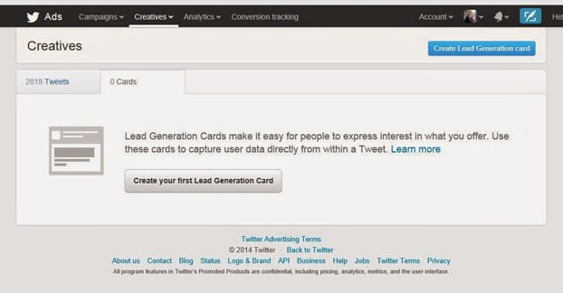
All you need to do is go to the ads console – found here – and find the option. If you’ve never used the ads console before, you’ll be asked to set up your account for ads for the first time. This involves:
- Specifying your country, which sets your billing currency and applicable local tax laws.
- Specifying a permanent time zone. This determines what time zone your scheduled tweets and other schedules apply. It’s also pretty confusing, since there are half a dozen options for each actual time zone. Just choose the one most local to you.
That’s it! You don’t need a specific Twitter for Business account or anything like that. All Twitter accounts – assuming they haven’t been suspended or blocked from the ads program for one reason or another – are able to access the ads system.
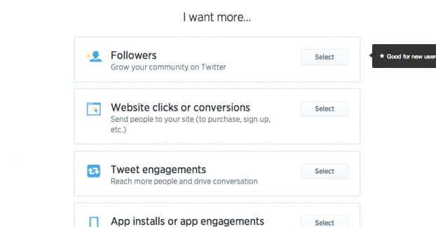
When in the ads console, you’re presented with a list of campaign objectives. These are tweet engagement, website clicks, app installs or app re-engagements, video views, followers, and leads. Each objective is a specific type of Twitter ad.
For a Twitter website card, you’re going to want to select the website clicks or conversions option. This brings you to your ad creation page. Here you can:
- Name your overall ad campaign.
- Select whether you want the ad to run immediately upon completion or start and end on specific dates.
- Apply a specific tracking tag, if you have any set up. I recommend you set some up for your objectives.
- Select your audience profile and targeting. By default, the only targeting option applied is “to your country of origin only.” You can also target by gender, by language, by device, platform, or carrier, and by keyword. Additionally, you can target based on the interests of another user’s followers, as well as tailored audiences, TV targeting, behavior targeting, and event targeting. You can read more specifically about targeting over here.
- Set your budget. A daily maximum budget is required, and you can set an overall total budget as an additional safety net. There are also advanced options, which include your bid type, which can be automatic, target, or maximum.
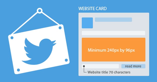
Finally, you’re able to compose the tweet itself. You can choose to “upgrade” an existing tweet, or you can compose a new one from scratch. If you’re composing a new one, you can plug in the tweet content itself with the standard 140-character limit. You can then fill out the website card specific information, which is your website URL, your image, your headline, and a name of the card for your internal analytics. The headline can be up to 70 characters in length.
You will, of course, have to have payment information in the system to run a website card, because it is a sponsored ad. Usually, this means a credit card.
Website card images are no larger than normal tweet images, by the way. They display in your feed as 440 x 220 rectangles. They should be larger and scaled down, but if they have text, make sure it’s readable.
Other Kinds of Twitter Cards
Twitter considers anything that isn’t a basic text tweet to be a card of some kind. Embedding an image, a Vine, or an animated gif are all examples of free cards.
Twitter does specify a few types, though.
- The Summary Card, which includes a title and brief summary of a website link, as well as a small photo icon about the size of a Twitter profile picture. It’s used for web content, blog posts, news articles, product pages, and anything else you want when you link to a website. This is specified by Twitter data on your website, in the meta field. If you don’t specify anything, Twitter will crawl and compose it itself.
- The Summary Card with Large image, which is identical to a summary card but has a larger horizontal image across the top. It looks much like a website card, but isn’t an ad.
- The Photo Card, which looks visually identical to the large image summary card, but emphasizes the image itself over the website content.
- The Gallery Card, which has a handful of small square images, for when you want to showcase several aspects of one subject in one post. You can mimic this by making a collage in a large image card.
- The App Card, which includes a basic link to an app for mobile users.
- The Player Card, which covers embedded YouTube videos. Of special note is that this card must be approved by Twitter’s team, and won’t work as a player card if you just link a video. You need to run it through the card validator. The player card will also work with audio files, such as Soundcloud links. This turns Twitter into a media player temporarily.
- The Product Card, which shows some product information specified by meta data. You can specify the creator and the exact content of the labels and the data in the label fields in your meta data.
Plus, there are other sorts of ad cards, each regulated by one of the types of ad objectives. In general, the ad cards will look like one of these types of cards, specifically to make the ad look more natural on Twitter. The only thing to make it stand out will be the “sponsored post” label that appears on all ads, as part of Twitter’s disclosure of paid content.
One thing to note is that the default “free” Twitter cards all require meta data on the site you’re linking to, for the information to be populated. Otherwise it just defaults to a summary card with scraped data. On the other hand, all paid Twitter ad cards allow you to specify all of the information within your ads center, without having to put code on your website. This gives you more finely tuned control for split testing and ad variation.
If you’re not in a position where you can add information to your site code, such as running a WordPress site, you can use plugins to do it for you. Jetpack does it by default, as does Yoast’s WordPress SEO.
Twitter Card Tips
First of all, always use a card when you can. Twitter may make you jump through hoops the first few times you set up cards, but it will go faster and faster the more you have approved.
Twitter cards, when shared by other users, are unfortunately truncated. They’re just simple text, a basic tweet, and the user needs to click or tap to expand the content and see the full card. This is how Twitter minimizes bandwidth and how they encourage a minimal level of engagement, which can in turn lead to more engagement.
Since Twitter cards are heavily focused on imagery, it makes sense that you’re going to want to focus on high quality media. Your tweet itself isn’t what draws people in, it’s the visual content. You’re going to want to go out of your way to produce clear, excellent media, whether it’s a vine, an audio file, or an image. That’s probably what you’re already doing, though, since images already increase engagement and clicks just by existing.
You are, of course, going to want to get into testing for website cards, particularly when you’re using pad advertising on a large scale. Instead of going all-in with your budget, test two different cards. Set up different cards within the same campaign – you can clone existing cards to save yourself some time – and change one aspect of it. This might be the image, it might be the headline, it might be the landing page, it might be the CTA button, or whatever else. Test different options against one another and iterate on the one that performs best.
One tip marketers can do is pin their paid cards. This makes sure that anyone who visits your timeline sees a high quality card, rather than just whatever your most recent post happened to be at the time. Make sure you have a pinned tweet that’s beneficial and attractive. Rotate out your pins on average once a month, or whenever it seems to have dropped off in value.
Twitter does include analytics, and you can get more by using a Twitter management app. There are hundreds of them out there, so I leave it to you – or a future post from me – to help you decide on that one.
Feel educated? Go forth, my friends, and make more graphical utilization of your Twitter feed with website cards. They’re simply too valuable to pass up, assuming you have anything at all to advertise. Which, if you’re visiting this site, I’m guessing you do.
Have you used Twitter website cards before? What were your experiences? I’d love to hear about your time, both positive and negative experiences.



nice article !!