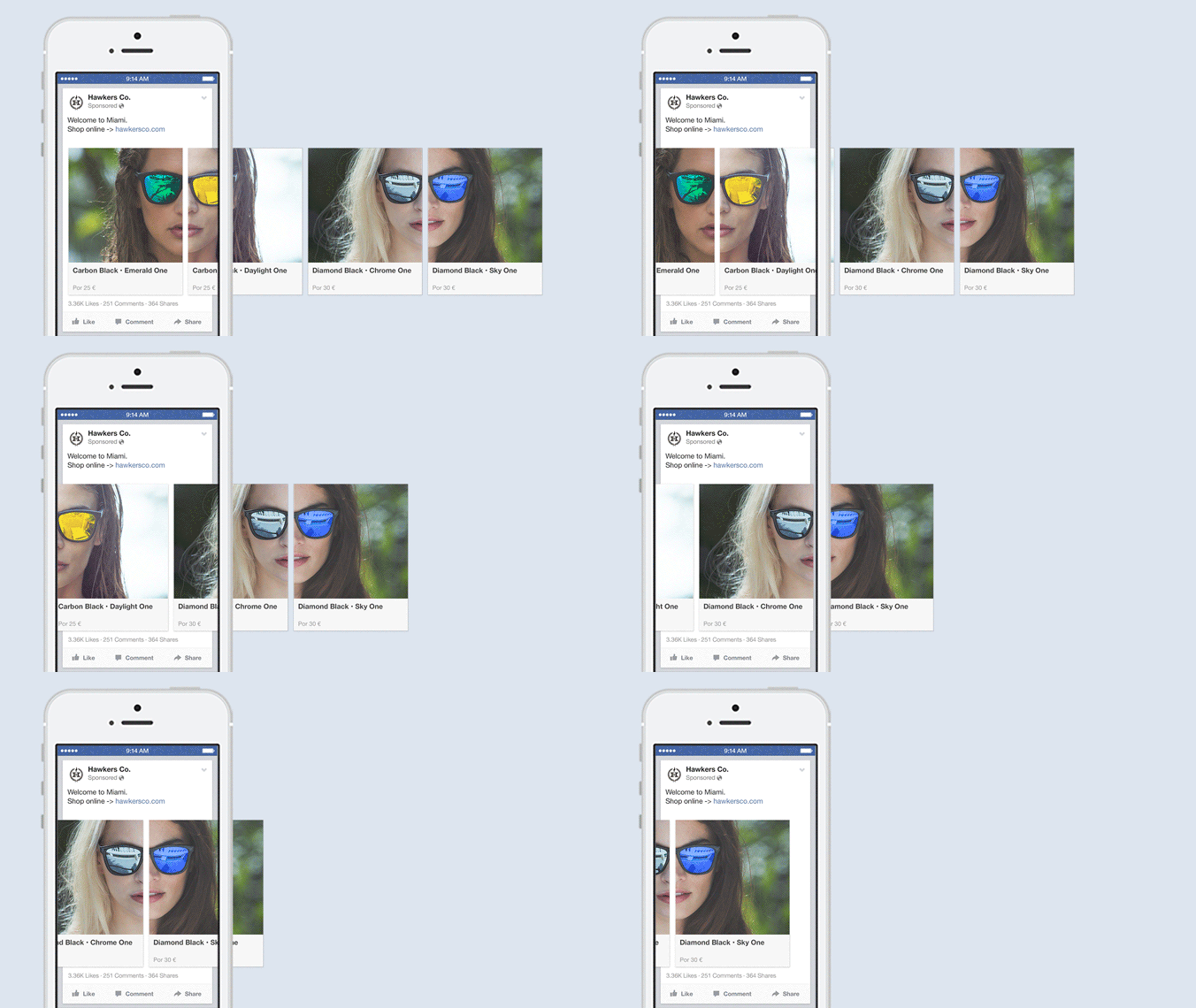
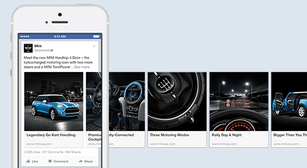
If you’ve been paying attention to advertising on Facebook and Instagram for the last few years, you’ve seen quite the evolution of options and tools available to the average marketer. One such innovation, initially introduced to Facebook in 2014 and brought to Instagram later, is the carousel ad.
To compare carousel ads, you need to know about traditional single image ads. So let’s talk about them both, and how they differ.
Single Versus Carousel
A traditional single image ad on Facebook or on Instagram looks like a normal post. They have a single central image, with text beneath or to the side depending on the platform. They can have a headline, a caption, and a link, the same as any other post.
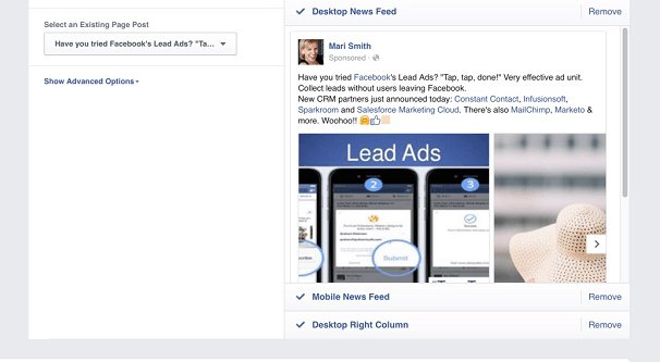
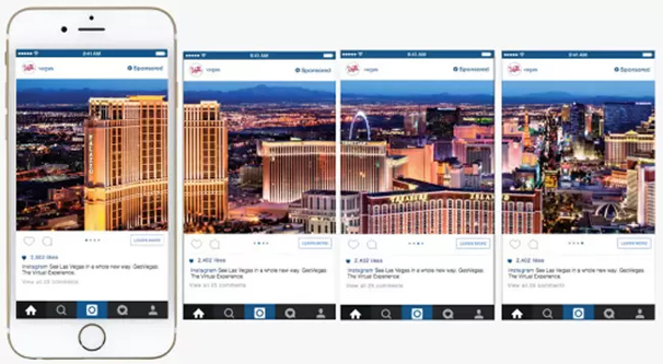
Carousel ads, meanwhile, are more like galleries. On Facebook, the place where you see a normal image in a post shows instead about 1.3 images. It shows one image, and the sliver of the next, with an arrow indicating that the user can swipe or tap to see the next image in the gallery. On Instagram, it’s more like a traditional multi-image post. Multi-image posts are more common on Instagram, so users intuitively understand them without the additional image sliver. All they need is the icon indicating multiple images in the post.
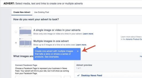
Both Facebook and Instagram ads are managed through the same platform, so while they display differently, they use the same resources on the back end. Of course, you can specify different images and different copy for each platform, but the ad restrictions are the same. Both platforms have Carousel ads, and they allow up to 10 total images in those ads.
Pros and Cons of Carousel Ads
What are the benefits to using carousel ads, and what drawbacks might be relevant when you’re trying to reach and engage with a specific audience? There are a lot of considerations, some of which you may not have known at first glance.
Pro: Carousel ads can showcase multiple related images. For example, your business selling sunglasses can show off up to ten different sets of frames with different styles of tint and reflection coating. A real estate business can show off a bunch of different photos of the interior of one apartment, rather than trying to pick one image that fully represents an entire living space.
Con: You have to create multiple good images for carousel ads. It stands to reason that if you have a carousel with 10 images in it, you need to have 10 good images to share. Even creating one good image for an ad can be a challenge, but optimizing ten of them is insane. Of course, you may only need to optimize three or four; nothing says you need to use all ten images, and in fact most carousel ads don’t make use of the full amount of space. Plus, you only need the first couple of images to be truly eye-catching; the rest will have a decreasing amount of exposure the deeper in the chain they are, as people decide to stop clicking through them.
Pro: Carousels can be used in innovative ways, such as ultra-wide images. Let’s say you’re a restaurant that specializes in lengthy sandwiches in a submarine format, some sort of Sub Way, perhaps. Let’s say you want to showcase a new sandwich. You have ten images; the first and the last are end points, and the middle are segments of the sandwich. Just one long image of a long lunch. Why not? It’s clever, it’s making use of a format, and it attracts attention. You have to contend with the white bars between images, but that’s not really that important.
This does only really work in Facebook’s carousel format, though; Instagram’s format won’t work as well. That’s neither a pro nor a con, though; just the reality of having two different ad systems at play.
Con: Carousels stand out from organic posts and are more obviously ads. On Facebook, multiple image posts take the form of a collage, with images arrayed in tiles. One image takes the stage, and the others wait in the wings for users to expand the gallery. The carousel style, with the horizontal scroll, is only for carousel ads. This means those posts stand out as ads more readily than single image ads. This isn’t a problem on Instagram, where multi-image ads and multi-image posts are virtually identical.
Pro: Carousels can showcase both depth and breadth. For depth, you can show something like the multiple images of an apartment, or multiple styles of one particular product. For breadth, you can showcase a range of different products. For example, Nike Athletics could showcase that they sell everything from shoes to headbands to water bottles to technology. Carousels have a lot of flexibility in this regard.
Con: It’s very easy to go overboard trying to Do Everything with one carousel ad. A lot of the carousels I’ve seen fail over the years fail because the advertiser treats them like 5+ different ads stapled together, rather than one more immersive ad experience. If you’re trying to do too much, your ad becomes unfocused, and you fail to pick up the attention you want to keep.
Pro: Carousels can include multiple links to multiple landing pages. If you’re showcasing a handful of different styles for a single product, you can send users to different pages for each style. Different links to different products work well. You aren’t limited to one landing page with multiple images. This allows you to keep your ads maximally relevant, which is important for your ads quality scores.
So while the pros may outweigh the cons in terms of numbers, as with anything related to advertising, the truth is somewhere in the middle. Both types of ads are good, and you can use both of them in your marketing. There’s no reason to limit yourself to just one ad type.
A Glance at Data
After looking at some data, at least in this specific niche, the comparison between single image ads and carousel ads is pretty interesting.
Traditional single image ads tend to perform better on average than carousel ads on Facebook. There are a few reasons for this.
For one thing, traditional ads look more like organic posts, so users with banner blindness or ad blindness tend to give them more attention before skipping past them. This means the potential target audience is likely a bit more engaged by default. Carousel ads are a format only used by ads on Facebook; multi-image posts are shown in a gallery format rather than the scrolling carousel.
Additionally, there’s a lot more information and a lot more experience out there running single image ads than there is for carousel ads. Ad professionals know how to optimize a single piece of copy and a single image, but a carousel ad can have as many as ten different sets of image, copy, and link. That’s way more to optimize!
Carousel ads are also more resource intensive. Split testing them is a challenge even if all you’re doing is reorganizing the order of the images in the carousel. If you’re swapping in new images, changing copy, and changing landing pages, it becomes even more complicated.
The costs for carousel ads on average, however, were lower. The cost per click for carousel ads was lower than for single image ads, though that obviously has a wide range of factors.
As such, a small spike in performance for carousel ads means significantly more return on your investment than it does for single image ads. Thus, for Facebook, the situation can be summarized thus: Carousel ads on Facebook have a lower average performance, but a higher potential ceiling. Single image ads have a lower maximum performance, but a higher average performance.
This is, again, only looking at a relatively small case study. What really matters is how you’re able to actually use your ads.
Instagram is also a different platform, even if the ads on the back end are the same. I’ve mentioned that on Facebook, carousel ads stand out as ads, since multi-image posts have a different format. That’s not the case on Instagram. With Instagram, multi-image posts and carousel ads look basically the same.
This has an interesting effect on the data; it reverses it. Carousel ads on Instagram have a lower ceiling than single image ads, but perform better on average. This may be because of how much more native they look, or it may be because Instagram users are more likely to click through and engage with ads than users on other platforms. Single image ads, meanwhile, have a lower average performance but a much higher potential ceiling.
Making the Best Use of Carousel Ads
The key to using carousel ads effectively is knowing what you’re trying to do with them.
Carousel ads are great for:
- Businesses that are advertising a variety of different products, or different styles for the same product. Remember; breadth or depth, pick one. Showcase the range of different products you have, or showcase the different customization options you have for individual products. In fact, you can build a remarketing list for users who click through to different products, and use carousel ads to show off the customization options for that product to that audience.
- Businesses that want to tell a story. Using multiple sequential images can be a great way to tell a story in a slideshow, with copy that explains what’s going on and why the reader should care. Since ads are inherently limited in space, making use of a full carousel gives you a lot more potential for a deeper discussion.
- Events. Conferences and conventions tend to have multiple events, games, drawings, or other reasons for an attendee to want to attend. A carousel ad can showcase up to ten of the scheduled events all in one place, hoping at least one of them will catch the attention of the target audience.
Of course, you also need to be very well-versed with experimentation and optimization to get the most out of carousel ads. A lot of people think “oh, the cost per click is lower, so these are cheap ads” when that’s not necessarily true. Since there are so many more moving parts, there are more points of failure. You need to know what to optimize, how to optimize it, and how to cut your losses early enough for it to matter.
A General Verdict
In my experience, and after looking at the data, I would say that if your niche can support carousel ads, and you can come up with a good story to tell with them or a good reason to use them over single image ads, go for it. Carousel ads are never going to fully let you down. They may not perform as well as single image ads you’ve been optimizing for months, but they’ll do well enough to make you a return so long as your audience targeting is on point.
Carousel ads on Facebook can work very well, but you absolutely need to make sure they catch the eye with the first image and a half. None of the other images matter at all if the user doesn’t click through to see them, after all. This isn’t an automatic slideshow like many websites use.
Carousel ads on Instagram are generally less impressive. I typically find their benefits to be somewhat minimal compared to how they perform on Facebook. They’re still worth using, but the bar for a high quality image on Instagram is a lot higher than on Facebook, and making several large ad images that are high quality and attractive has a lower rate of return on Instagram. Even still, if you can knock it out of the park, you can certainly give it a try.

